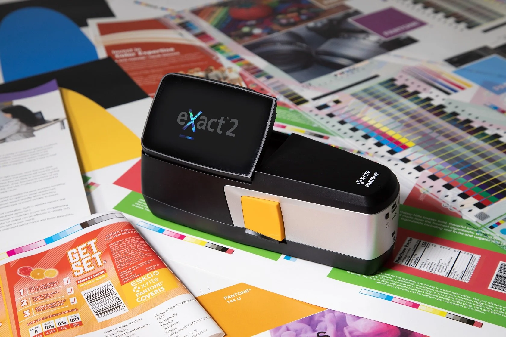
Reimagining the eXact—the print industry’s standard tool for measuring and matching color.
X-Rite Pantone
Practice:
Contextual Interviews
Prototyping
Usability Testing
What’s the next evolution of a tool users already swear by?
X-Rite—parent company of the Pantone color matching system—is the leader in color science and technology. Their handheld color measurement devices and software are used across the globe for ensuring that brand colors are consistent to the human eye across all applications—from the billboard, to the cardboard box, to the metal can of soda in your hand.
Context
The eXact 1 has been the printing and packaging industry’s staple for ensuring that brand colors and ink densities appear consistent across substrates and applications—from the ink lab to the printing press. However, the eXact 1’s convoluted interface and poor ergonomics (namely, the clamshell design that springs off of slanted desks) presented an opportunity to re-evaluate the experience around the device and design a new and improved second generation device for the eXact’s cult following.
The Challenge
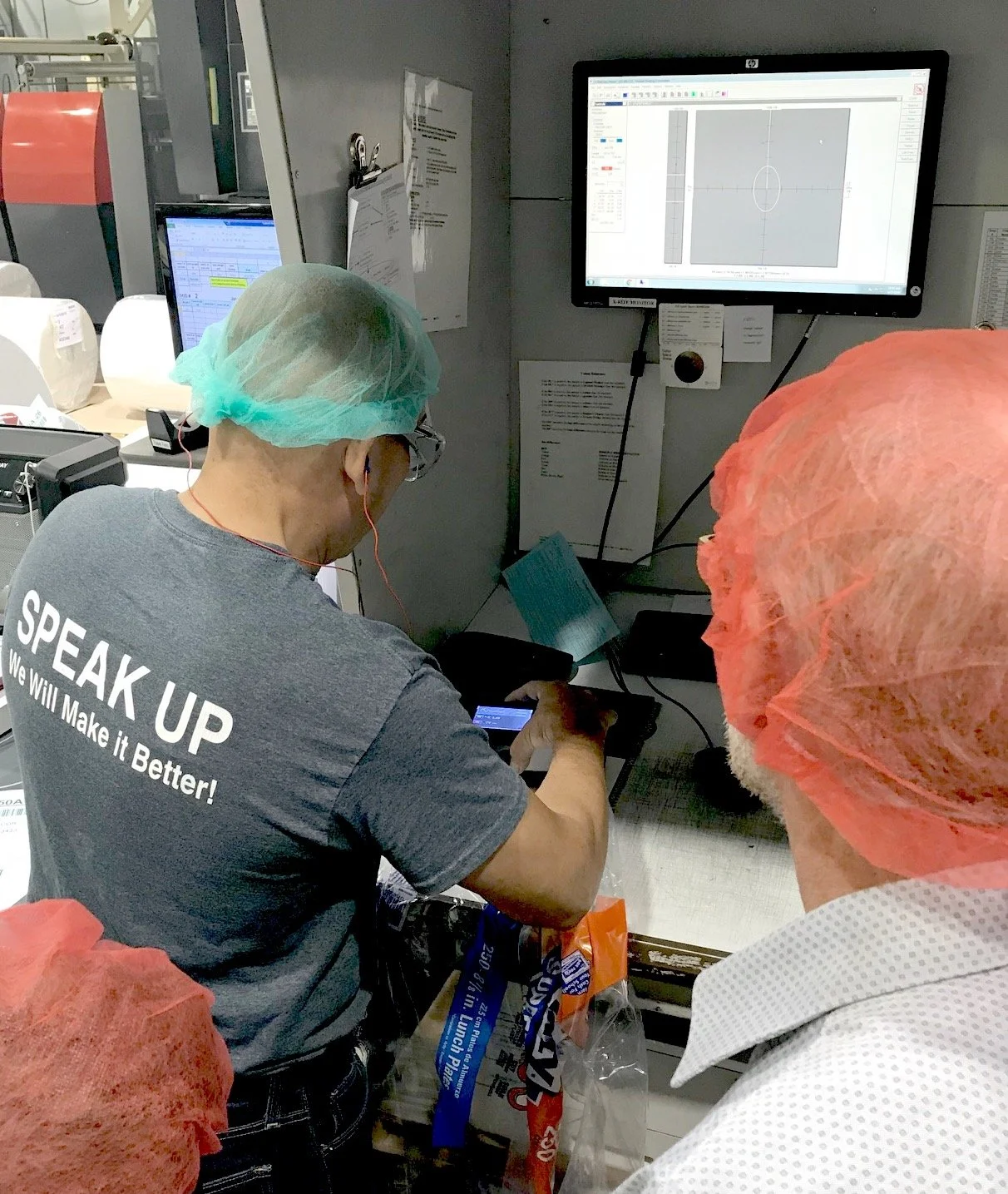
Press Operator: The Press Operator—one of the many user types of eXact—conducts a patch test with the device.
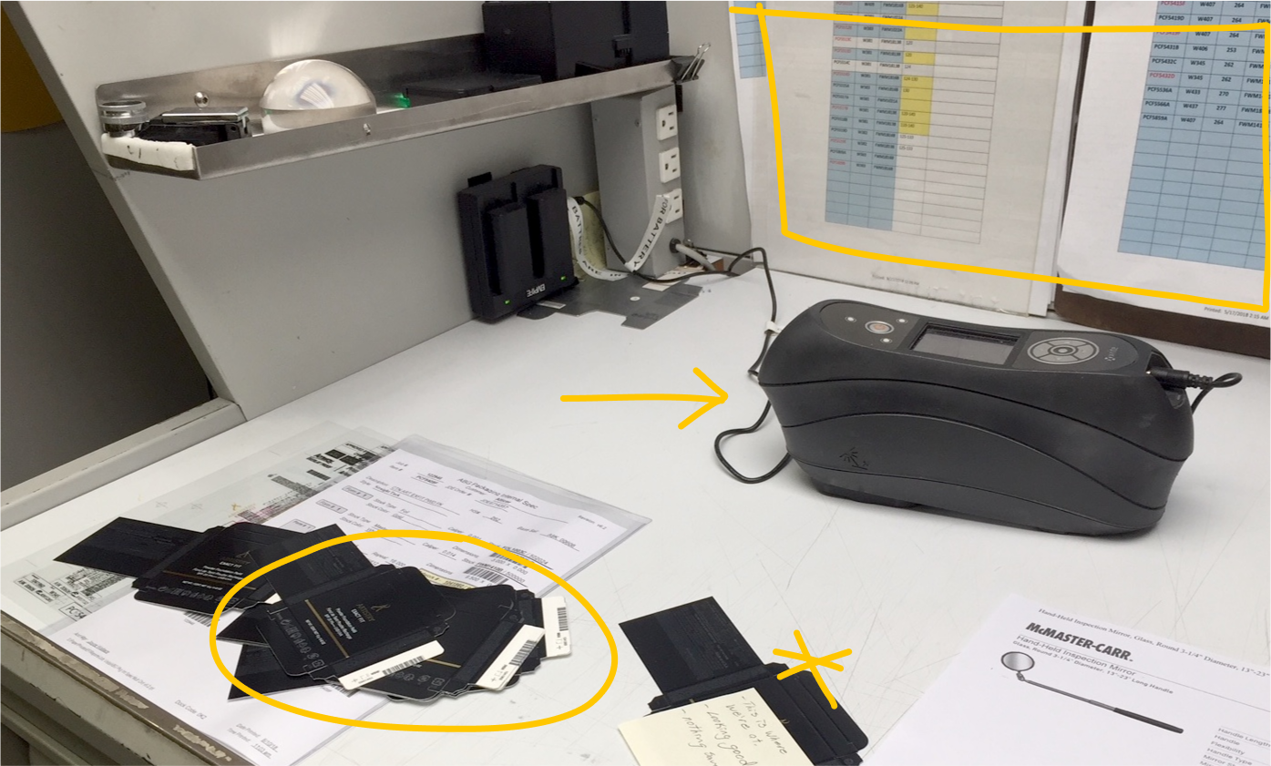
Work Station: The Press Operator’s work station, featuring the eXact in tethered mode, a stack of patch tests and reference sheet hung on the wall.
We visited several printing facilities and ink labs to meet with a range of eXact users and interview them while they went about their processes, using the device in context. This helped us better understand their unique workflows, pain points and workarounds. Which, ultimately helped us develop personas and service blueprints.
In the Field


Persona Profile: One of our many personas, dubbed “Spike” for easy reference.
Service Blueprint: I created a service blueprint for each user environment, mapping every interaction with tech or people. Printed in large format, they covered our meeting room walls to anchor conversations in real user experiences.
Mapping Complexity
Because of the complex and intricately connected nature of the handheld device, building out service blueprints was critical in the beginning—so we could easily reference the nuanced workflows throughout the research and design process. Each user interacted with the device differently and paired it with different X-Rite software, so I led the team in creating a service blueprint for each persona.

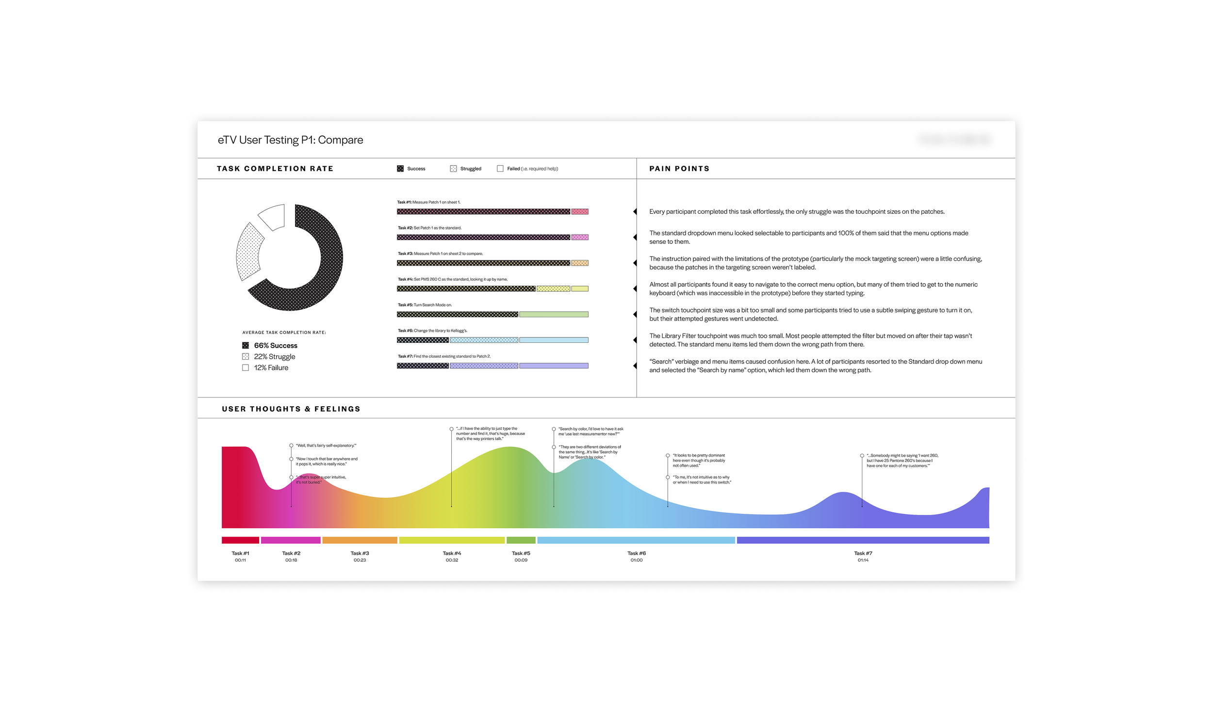
Usability Testing Results: Analyzing the completion rate of each task in a workflow pointed out the areas that still needed to be ironed out.
After interviewing users directly and taking stock of all customer feedback, we prioritized UI updates based upon how impactful they would be to the user and how much effort they would take to develop.
Prioritization
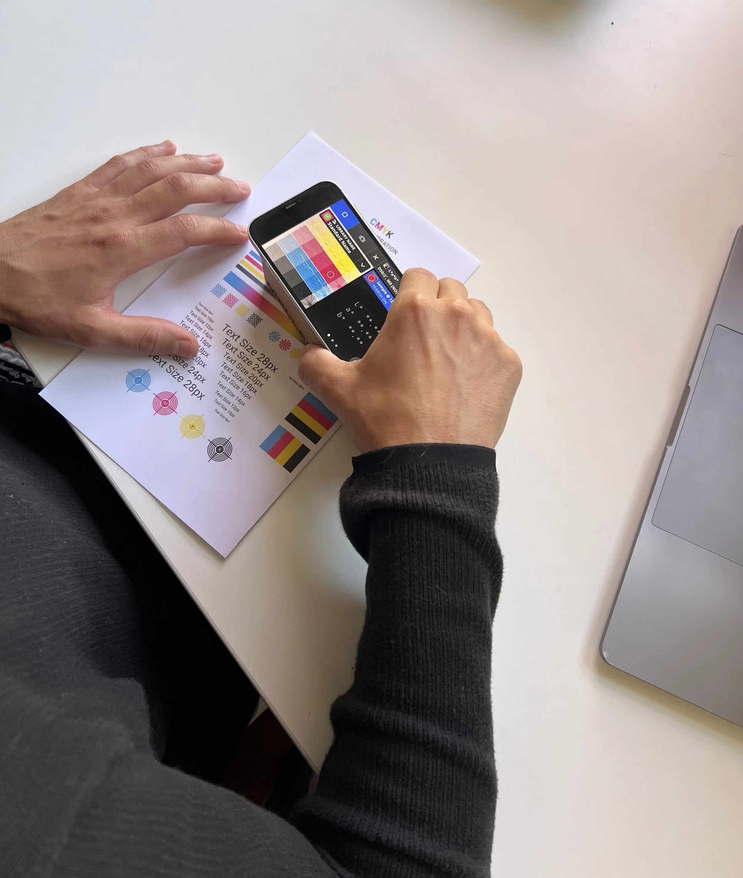
Working Prototype: We rigged a pseudo-eXact—an iPhone displaying a “tap-through” prototype attached to a small cardboard box (about the size of the final device)—and observed participants as they tackled each workflow.
Participants received a handheld prototype of the eXact and a list of tasks that reflected user workflows. Doing this with a range of user types and skill levels was critical to understanding where novices would get tripped up or experts were slowed down. Several rounds of this helped us design the most seamless color measuring experience the Pantone universe has ever seen.
Usability Testing
Gen2 Release—
7% more workflow efficiency
The result was the release of the second generation eXact device, which sported the first-of-its-kind video targeting system, 33% more screen space and 7% more workflow efficiency—the most intelligent and integrated device on the market. Turns out, you can render the gold standard platinum.
I'm available for consulting roles or open to becoming part of an in-house team.
If you’re looking for support from a collaborative insight seeker, reach out!